Tutorials
ReactJS Example
In this section, we will create a minimalistic react app that uses the ORY Editor. Before we skip ahead, make sure that node.js is installed on your system.
At the moment, the ORY Editor is available only through npm and works best in a ReactJS environment.
ReactJS
Our goal is to create a ReactJS app that uses the editor. To scaffold the react app for the purpose of this tutorial, we use create-react-app
$ npm i -g create-react-app
$ create-react-app .
and install the editor using npm:
$ npm i --save ory-editor
Next, open the file src/components/App.js and include the ORY Editor:
import React, {Component} from 'react'

// The editor core
import Editor, { Editable, createEmptyState } from 'ory-editor-core'
import 'ory-editor-core/lib/index.css' // we also want to load the stylesheets

// Require our ui components (optional). You can implement and use your own ui too!
import { Trash, DisplayModeToggle, Toolbar } from 'ory-editor-ui'
import 'ory-editor-ui/lib/index.css'

// Load some exemplary plugins:
import slate from 'ory-editor-plugins-slate' // The rich text area plugin
import 'ory-editor-plugins-slate/lib/index.css' // Stylesheets for the rich text area plugin
import parallax from 'ory-editor-plugins-parallax-background' // A plugin for parallax background images
import 'ory-editor-plugins-parallax-background/lib/index.css' // Stylesheets for parallax background images
require('react-tap-event-plugin')() // react-tap-event-plugin is required by material-ui which is used by ory-editor-ui so we need to call it here

// Define which plugins we want to use. We only have slate and parallax available, so load those.
const plugins = {
  content: [slate()], // Define plugins for content cells. To import multiple plugins, use [slate(), image, spacer, divider]
  layout: [parallax({ defaultPlugin: slate() })] // Define plugins for layout cells
}

// Creates an empty editable
const content = createEmptyState()

// Instantiate the editor
const editor = new Editor({
  plugins,
  // pass the content state - you can add multiple editables here
  editables: [content],
})

class App extends Component {
  render() {
    return (
      <div>
        <div className="App-header">
          <img src={logo} className="App-logo" alt="logo"/>
          <h2>Welcome to React</h2>
        </div>

        {/* Content area */}
        <Editable editor={editor} id={content.id}/>

        {/*  Default user interface  */}
        <Trash editor={editor}/>
        <DisplayModeToggle editor={editor}/>
        <Toolbar editor={editor}/>
      </div>
    );
  }
}

export default App;
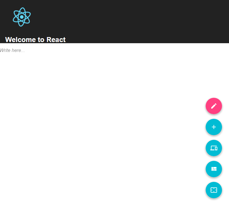
That's it, congratulations! You should see something like this now:
Writing Plugins
Writing a content plugin
Of course, you are not limited to this functionality and can easily write your own plugins. Plugins have two parts, one plugin definition and a ReactJS component. A minimal plugin definition looks as followed
import React, {Component} from 'react'

// You are obviously not limited to material-ui, but we really enjoy
// the material-ui svg icons!
import StarIcon from 'material-ui/svg-icons/toggle/star'

// This is the ReactJS component which you can find below this snippet
import InputTextField from './Component'

export default {
  Component: InputTextField,
  IconComponent: <StarIcon />,
  name: 'example/content/input-text-field',
  version: '0.0.1',
  text: 'Input Text Field'
}
and a minimalistic plugin example could look like:
import React from 'react'

// A callback function for the input field
const onInput = (onChange) => {
  return (e) => {
    // Dispatch the onChange action with the new value
    onChange({
      value: e.target.value
    })
  }
}

const InputTextField = (props) => {
  const {
    state: { value },
    readOnly,
    onChange
  } = props

  // If readOnly is false, it means that we are in edit mode!
  if (!readOnly) {
    return (
      <div className="my-plugin">
        <input
          type="text"
          onChange={onInput(onChange)} value={value} />
      </div>
    )
  }

  // If we are not in edit mode, remove the input field
  return (
    <div className="my-plugin">
      {value}
    </div>
  )
}

export default InputTextField
Of course, there are more settings and callbacks available. We encourage checking out the API docs on this topic!
Make sure the onChange prop is never passed through to an HTML element (eg via {...props}), as this will overwrite the state of your plugin with any change event emitted by that element. This applies to both content and layout plugins.
Writing a layout plugin
Of course, you are not limited to this functionality and can easily write your own plugins. Plugins have two parts, one plugin definition and a ReactJS component. A layout plugin will require an initial children, otherwise, it will automatically destroyed. A minimal layout plugin definition looks as follows
import React from 'react'
import slate from 'ory-editor-plugins-slate'

// You are obviously not limited to material-ui, but we really enjoy
// the material-ui svg icons!
import CropSquare from 'material-ui/svg-icons/image/crop-square'

const BlackBorderPlugin = ({ children }) => (
  <div style={{ border: '1px solid black', padding: '16px' }}>
    {children}
  </div>
)

export default {
  Component: BlackBorderPlugin,
  IconComponent: <CropSquare />,
  name: 'example/layout/black-border',
  version: '0.0.1',
  text: 'Black border',
  createInitialChildren: () => ({
    id: v4(),
    rows: [
      {
        id: v4(),
        cells: [
          {
            content: {
              plugin: slate(),
              state: slate().createInitialState()
            },
            id: v4()
          }
        ]
      }
    ]
  })
}
On that example, the initial children is a slate plugin.
Rendering HTML
The ory-editor-renderer package ships a lightweight HTML renderer module. You can use it for server-side rendering
and rendering the content client side.
import { HTMLRenderer } from 'ory-editor-renderer'

const state = { /* ... */ }
const plugins = {
  layout: [/* ... */],
  content: [/* ... */]
}

const element = document.getElementById('editable')
ReactDOM.render((
  <HTMLRenderer state={content[0]} plugins={plugins}/>
), element)
Saving and restoring editor contents
Use the onChange callback to obtain a copy of the editor's state for saving to persistent storage. The state can then be later loaded into the editor, or used by the ory-editor-renderer package for rendering to HTML.
import React, {Component} from 'react'
import Editor, { Editable, createEmptyState } from 'ory-editor-core'
import slate from 'ory-editor-plugins-slate' // The rich text area plugin
import { Trash, DisplayModeToggle, Toolbar } from 'ory-editor-ui'
const EditorPlugins = {
  content: [slate()],
  layout: [/* ... */],
};

function saveToDatabase(state) {
    return fetch('/my/save/url', { method: 'POST', body: state });
}

class MyEditor extends Component {
  componentWillMount() {
    this.editorState = this.props.content || createEmptyState();
    this.editor = new Editor({ EditorPlugins, editables: [content] });
  }
  render() {
    return (
      <div className="my-editor">
        <toolbar>
          <button onClick={() => saveToDatabase(this.editorState)}>Save</button>
        </toolbar>
        <Editable editor={editor} id={content.id} onChange={state => (this.editorState = state)} />
        <Trash editor={editor}/>
        <DisplayModeToggle editor={editor}/>
        <Toolbar editor={editor}/>
      </div>
    )
  }
}
The state could then be fetched and rendered by doing something like:
import React, {Component} from 'react'

import { HTMLRenderer } from 'ory-editor-renderer'
import { createEmptyState } from 'ory-editor-core'

class MyEditorRenderer extends Component {

  componentWillMount() {
    this.plugins = {
    this.setState({ contents: createEmptyState() });
    fetch('/my/save/url').then((savedState) => {
      this.setState({ contents: savedState });
    })
  }

  render() {
    return (
      <div className="my-editor">
        <HTMLRenderer state={this.state.contents} plugins={EditorPlugins} />
      </div>
    )
  }
}

const element = document.getElementById('editable')
ReactDOM.render((
  <MyEditorRenderer />
), element)
Handling native drag events
The ORY Editor is capable of handling native drag and drop events. Native events include dragging of links, text,
and images. Native drag support can be enabled by writing a NativePlugin and passing it during instantiation.
In this example, we will use the default plugin, and take a look at how you can create your own later.
import native from 'ory-editor-plugins-default-native'

const editor = new Editor({
  plugins: {
   layout: [],
   content: [],
   native
 }
})
If native is undefined or null, native dragging wil be disabled. This is the default setting.
Writing a native plugin is like writing a content or layout plugin. The only difference is that our native plugin must
be wrapped in a factory that receives three arguments - hover, monitor, and component. Hover is the cell or row
that is currently being hovered. Monitor is the DropTargetMonitor
coming from react-dnd and component is the React component of the cell or row that is currently being hovered.
In sum, an exemplary plugin looks like this:
import React from 'react'

const Native = () => <div>native</div>

export default (hover, monitor, component) => ({
  Component: Native,
  name: 'my-native-plugin',
  version: '0.0.1'
})
Because this plugin is wrapped in a factory, we are able to modify its behaviour based on the properties we receive. One such example would be to add the item's data to the initial state for later use.
export default (hover, monitor, component) => ({
  // ...
  createInitialState: () => ({
    item: monitor.getItem()
  })
})
Per default, the editor assumes that dropping the native element creates a content cell. To change this behaviour, use
the key type:
export default (hover, monitor, component) => ({
  // ...
  type: 'layout'
})